
6 Mobile Website Design Best Practices
Is Your Website Mobile-Friendly? by jasmine malia
The New Normal
The way we interact with the internet has undergone a dramatic shift. Gone are the days of bulky desktops dominating the digital landscape. Today, smartphones reign supreme, with billions of users accessing the web primarily through their mobile devices. This mobile-first reality has significant implications for businesses, particularly when it comes to website design.
It is generally reported that over half of global web traffic comes from mobile devices, with figures often cited around 50-60%. This dominance is projected to continue, solidifying mobile as the primary platform for web browsing. Ignoring this trend puts businesses at a significant disadvantage.

Rethinking Design for Mobile Users
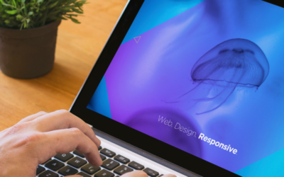
Responsive design, where a website automatically adjusts its layout for different screen sizes, was once considered the gold standard for mobile optimization. However, in today’s mobile-first era, a more nuanced approach is necessary.
Here are 6 Best Practices You Should be Following on mobile:

Avoid Pop-Ups
On desktop websites, pop-ups are effective for encouraging actions, particularly when a user is about to leave the page. However, they tend to be frustrating on mobile sites.
On mobile devices, pop-ups can be challenging to load and are often hard to see on smaller screens. Additionally, users struggle to close pop-ups since the “exit” or “X” buttons can be difficult to locate and click.
PRO TIP
Use a call to action button

Use Fewer Menu Options
Long dropdown menus can be frustrating to navigate without a mouse and difficult to view on smaller screens. It’s advisable to limit the options, focusing on the most popular choices.
Hamburger icons are commonly used on mobile sites to hide menus in responsive designs. Usually found in the top right corner, clicking the icon reveals the full menu and also has an option to close the menu.
PRO TIP
Limit your menu options to 5

Make Buttons POP
Visual elements like rounded corners and shadows can create a more inviting and tangible appearance for buttons. Adding subtle animations, such as a slight color shift or elevation change when tapped, can significantly enhance the sense of interactivity, making the user experience feel more engaging and dynamic.
To ensure buttons stand out, use contrasting colors & larger buttons to improve visibility.
PRO TIP
Add an icon to your button

Think of the Thumb
Be sure to keep button placement consistent throughout the site to avoid confusing users. Primary buttons should be in the same location on each page.
Position action buttons, such as Submit or Next, within the thumb zone. Also, make buttons large enough to easily tap. The thumb zone is the area of the screen that is easily reachable with your thumb when holding the phone with one hand.
PRO TIP
Size buttons 48px or taller

Keep Pages Decluttered
An overload of web elements on a mobile site can overwhelm users, potentially driving them away. Opting for simpler designs with fewer components is ideal for your mobile visitors.
On mobile websites, it’s essential to utilize whitespace more than on desktop versions. This approach directs the user’s focus to the most crucial parts of the page, enabling them to quickly understand key information.
PRO TIP
Keep 8-16px between elements

Enhance Text Readability
The smaller screens of mobile devices can make web page headlines and content harder to read. A simple way to enhance legibility is by increasing the font size. While users can zoom in, but that negatively impacts their user experience.
It’s best to use straightforward fonts applying bold styling to emphasize key content. This approach ensures a better reading experience for all users.
PRO TIP
Use 16px plus font size for mobile
article by jasmine malia
SHARE THIS ARTICLE
RELATED ARTICLES


© 2024 Studio Jasmine Malia llc | All rights reserved